Wednesday, 15 December 2010

Final Typeface For Titles And Taglines

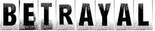
To create our Movies title 'logo', we decided on the free-for-use typeface 'Ghetto Marquee' by Kirk Shelton, found on dafont.com


This is what our film title looks like in the font.


In our trailer we are using strong phases that relate to the story to give the audience a little more information. One of these 'FORRBIDDEN LOVE'. We decided to use the typeface as the title, but to make them look more 'beaten up', Piers used Adobe Photoshop to make the letters crooked, and he also adjusted the second 'E' so it looked different from the first. We decided to give it a red hue to distinguish them from the title.

Wednesday, 3 November 2010

Text Drafts


These are a few ideas of texts. We quite like the idea of the bottom left and right, however they imply more horror than Gangster. The bottom two signify violence as the letters look like they have been slashed, and been bleeding.

Thursday, 21 October 2010

Magazine Final Front Cover Layout

This is our final magazine cover. We have the trio at the top and the London City skyline below. The only thing we have changed since doing this poster is the colour for the title. We no longer want the text to be the colour blue because it is not appropiate for the genre and the content of this film. The pugs are clear on this front cover. This front cover focuses entirely on the film 'Betrayal' this gives the reader the exclusive inside to the film, because it is clearly the main focus of this issue. We decided to use the London city skyline in our magazine front cover because we wanted to emphasize this being a 'British Gangster' film.

Wednesday, 20 October 2010

Final Film Poster Layout

This is our film poster with analysis. This is our layout for our film poster. We have the trio at the top of the poster we then have the London Skyline to enforce the idea this is a 'British Gangster' film. We included the gun as an enigma code to show that this film is to expect violence. The catch line read underneath says "They were disloyal to their family now they pay...." This sets the mood and atmposphere for the film. I think this is a successful layout for a film poster because it informs the audience about what sort of film it is but is simple and does not give too much away.

Tuesday, 19 October 2010

Skyline Development


These are some of our ideas for our London skyline that a member of our group designed on the computer. At present we favour the red and black skyline (third one down on the first picture). We favour this one currently because we like the contrast and the effect of the red and black. It also depicts violence in a urban setting, red possibly signifying blood.

Friday, 15 October 2010

Name Choice

We have decided on a title for our 'Gangster' film trailer after we came up with several ideas as a group but we finally agreed on 'Betrayal'. This title reflects our storyline and also grabs the audience's interest beacuse it adds drama to the film.

Thursday, 14 October 2010

Shot List (Final)

1. Dark shots with flashes of main characters, with a brief introduction narrated via voice over.
2. Close up shots of the two lovers, showing that they are clearly in love.
3. Next we see the Father of the girl, shot in dark lighting. He finds out about his daughter's relationship and immediately orders a hit on them both.
4. Shot of darkness, - blackout effect to suggest some time has passed.
5. Two lovers are running and screaming. They are being pursued.
6. Blackout we hear screams and gunfire.
7. We have further blackouts to suggest time has passed.
8. A boot of a car is opened and a body is put in.
9. Another quick blackout.
10. A quick shot of the car pulling off.
11. Another quick blackout.
12. Car driving on motorway.
13. Another quick blackout.
14. Car arriving at harbour.
15. Another quick blackout.
16. Body been thrown off boat.