Sunday, 20 February 2011
Voiceover
Piers and I managed to record our own voiceover using a microphone. We both had a go at trying different accents, as a group we decided to go with Piers' American accent we also lowered his voice. I think this was a good choice, because the American accent even for British film trailers are stereotypically American.

Thursday, 17 February 2011
Magazine Cover Progress
These are screenshots of the cover I have developed at various stages.


1.
2.  3.
3.
As you can see below I decided to get rid of the four boxes I decided that it would be better with a background picture, rather than four small pictures.
3.As you can see below I decided to get rid of the four boxes I decided that it would be better with a background picture, rather than four small pictures.
Friday, 21 January 2011
Sound And Effects Company
This is the logo for 'Signature' the sound and effects 'company' that would contribute to the film. We are hoping to use an animated version in our trailer where the logo is 'written'.

Friday, 14 January 2011
Production Company
We decided on 'Stargaze Productions' as our production name and Calum made a logo for use at the beginning of the trailer. Calum decided to go for a futuristic or 'space like', design. He came across a font similar to the font used in the film 'Star Wars' I think it works really well, and looks quite professional. 
Monday, 3 January 2011
Basic Plot
- Two lovers, children of rival gang leaders, have a relationship in secret. Despite their efforts, their Fathers (or one of them) discovers this and orders the assassination of them both.
- The couple are interrupted while together by a 'hitman' and are seemingly both killed. Their bodies are thrown into a harbour.
- The girl survives, though injured. Her lover is dead. She is bent on revenge against her Father.
- She kills her assassin. She also kills many more people on her journey to her Father. She does this seemingly without hesitation.
- Her Father dicovers that it is his daughter killing his men. Rather than feeling remorse or paternal compassion he steps up his game and orders her immediate death.
- She eventually finds him but leaves him to live, though a broken and helpless man.
The following diagram shows the flow of events as seen in both the feature film and the trailer.
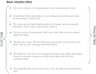
The final scene is not focused at all in the trailer as we do not want to reveal the ending of the story.
Wednesday, 15 December 2010
Final Typeface For Titles And Taglines
To create our Movies title 'logo', we decided on the free-for-use typeface 'Ghetto Marquee' by Kirk Shelton, found on dafont.com

This is what our film title looks like in the font.

In our trailer we are using strong phases that relate to the story to give the audience a little more information. One of these 'FORRBIDDEN LOVE'. We decided to use the typeface as the title, but to make them look more 'beaten up', Piers used Adobe Photoshop to make the letters crooked, and he also adjusted the second 'E' so it looked different from the first. We decided to give it a red hue to distinguish them from the title.

Wednesday, 3 November 2010
Text Drafts

These are a few ideas of texts. We quite like the idea of the bottom left and right, however they imply more horror than Gangster. The bottom two signify violence as the letters look like they have been slashed, and been bleeding.
Subscribe to:
Posts (Atom)